Click on any image below to see a larger version.
Magazine Spread – Life Spaces:


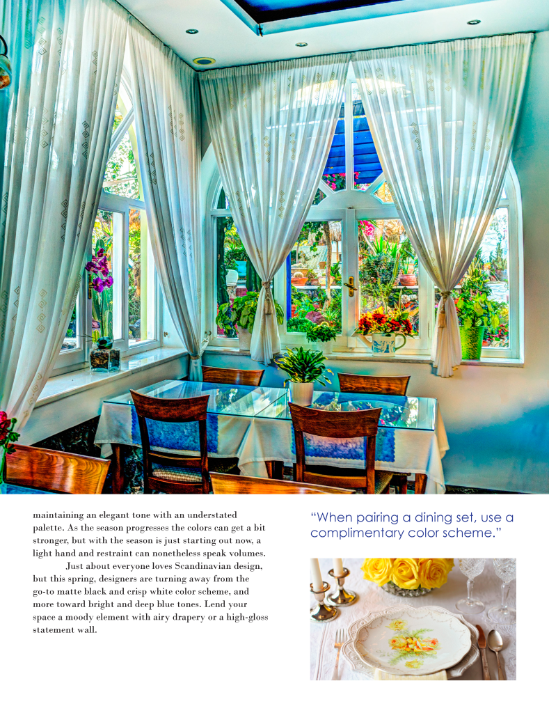
About Project:
With this project, I was tasked with designing a new front cover, and one inside spread for a magazine, Life Spaces. I worked to stay similar in the design aspects with the actual magazine and created something bright and eye-catching for a new issue.
Headlines:
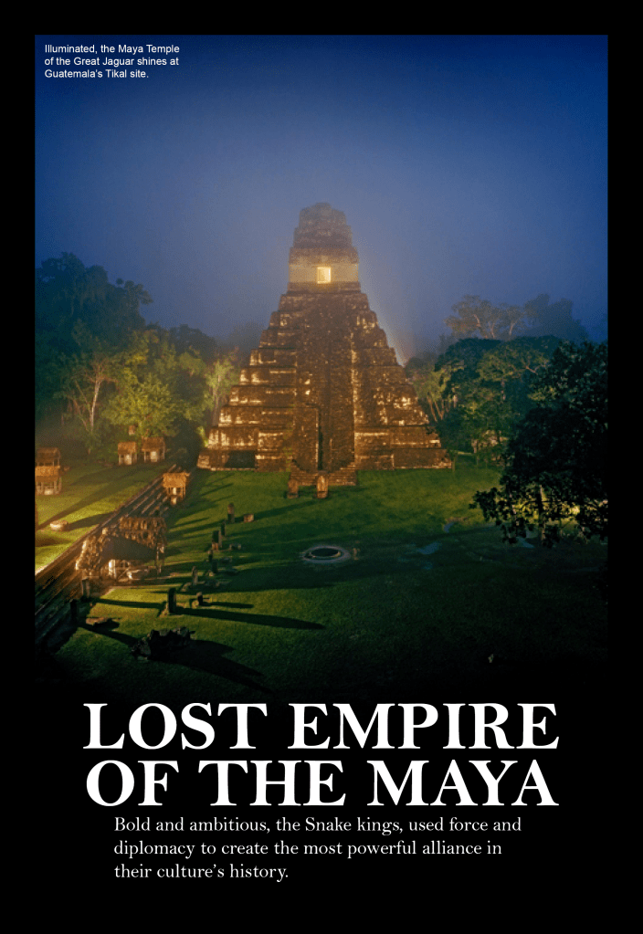

About Project:
For this project, the end goals were to showcase our abilities in fitting the content of a header and subhead into the branding style of various brands of magazines. I chose to work with WIRED and National Geographic magazines and follow those two companies’ dimensions, colors, style, and typography as closely as possible.
Billboard & Double-Sided Mailer:


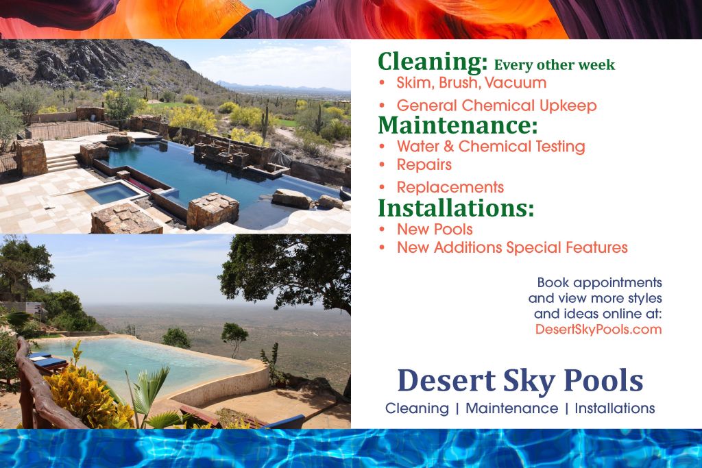
About Project:
With this project, I made up a pool company name, Desert Sky Pools for Arizona. I worked to create a double-sided mailer with some type of coupon/ discount on it and a billboard. I stayed with a limited color palette regarding the text and design elements that were not photoed elements.
UI/UX Design – Web Mockups:


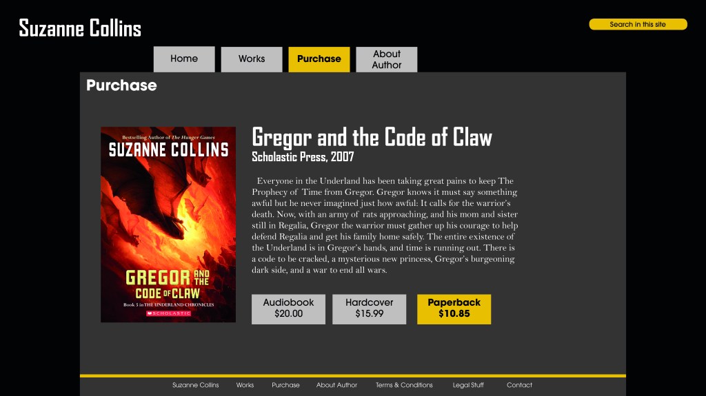
About Project:
In this project, I worked alongside teammates in analyzing UI/UX design and accessibility- Information Architecture, of sites that already exist. We worked with the Suzanne Collins website and compiled research, testing, and data together to determine what types of things we’re currently working on versus what we decided may need to be re-worked. Based on research, discussions, and results, each teammate was responsible for planning, designing, and coming up with new design mockups for the more recent website version.
Brand Identity for Patches Tailoring & Alterations:


About Project:
I was tasked with creating a complete branding guide and business package for a new tailoring and alterations company called Patches for this project. I made the branding and strategy for this company and compiled it into an overall presentation for the client. It included branding basics like a logo, typography, color palette, business stationery, and a small pillow box package design. I wanted the package to be something that could be given to each customer that comes in with a more extensive job; the package would be a little emergency sewing kit for the specific piece they came to Patches with for tailoring or alterations.
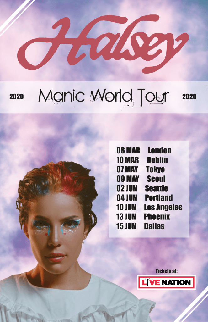
Concert Posters:

About Project:
These posters were two separate projects but similar in the content on them. For the Lindsey Stirling one, I was tasked with reaching out to Comerica Theatre regarding their usage of branding for their logo. I also researched the “Shatter Me” Music Video(MV) to get inspiration and came up with the inlaying the gears to give off a steampunk alt vibe to match with visuals from her MV. I chose fonts that best represented and fit the look of this tour and her music.
With the Halsey poster, I did similar research for inspiration by visiting the artists’ website and viewing images and videos to make sure I got as close as possible to the aesthetic for their album. I worked with various imagery and put things together to make an excellent space for all of the content that needed to be placed.
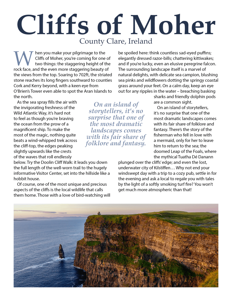
Typography and Imagery:


About Project:
In this project, I worked with striking imagery and text. The goal for this project was to take the headlines and body text and arrange them in a pleasing matter alongside an eye-catching photo. I utilized colors from each image for the text and adjusted alignment, kerning, and tracking.
